Mar 142011
 

When earthquake/tsunami struck Japan on Friday, I'm sure you would have heard in the media how this was affecting the sentiments of the markets. Here are few things one must know :

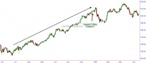
Let us take a look at the powerful Kobe Earthquake that struck Japan in 1995 and caused $102.5 billion damage:

Nikkei - during Kobe Earthquake

It is obvious from the chart that the Earthquake occurred during the down trend and did not create any reversal on its own.

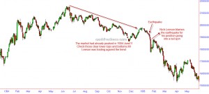
Now let us a look at the Latur Earthquake that left nearly 8000 dead in India and its impact on Sensex.

Sensex and Latur Earthquake

What about the Tsunami of 2004 that left 230,000 dead in Asia?

Nifty during Tsunami04

Looking at the charts, if one were to think no natural disaster occurred on Dec 26th 2004, he/she can be excused!!

The picture is similar even if one looked at the man-made disasters like Bomb blasts and terrorist attacks!

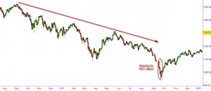
The infamous WTC attack:

While the reaction may have been pronounced, would it have mattered had it occured when the market trend was up?

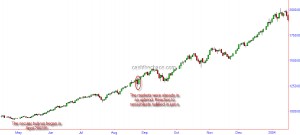
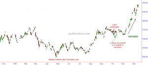
So let us look at markets reaction to mumbai serial blasts of August 2005:

Nifty during the Aug 03 Serial blast

So, the next time you hear someone on media say that such and such exogenous events is causing the markets to decline you might want give these charts a thought. While there might be initial knee jerk reactions, these events do not even cause short term reversals!!! All one has to know is, what is the trend.
Mar 102011
 

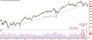
Copper, which is often considered a proxy for the global growth, dropped through some important support levels.

Copper Futures - Daily Chart

The intermediate term trendline from June lows, which was holding up this market, gave way along with expanding volumes. The move from June lows to the November highs is a clear 5 wave pattern and the 5th wave is also related to the 1st wave by a Fibonacci ratio - a normal ending wave relationship. Also noticeable on the charts is the volume expansion as the red metal declined from its February highs.

The blue dotted line shown on the charts could be considered as a Head and Shoulders top and the breach of 424 price level would become the breach of the neckline that completes this pattern.

Considering all the above evidences, it does look like the metallic professor is saying the winds of change are here for the global economy. Expect the S&P 500 to drop below 1294 swing low in the immediate future which in turn is likely to result in a larger decline.

Feb 182011
 

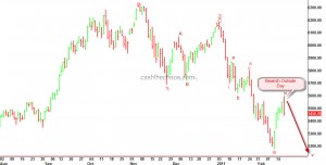
The relief rally for the Nifty that began from the lows of February 11th, ended today with a strong reversal bar. As can be seen from the chart below, today's price action shows a rejection of the early highs and sellers have overpowered the buying pressure of the previous day too. This bearish outside day is marked on the chart.

Nifty - Daily charts

If my Elliott wave labelling is correct, Nifty should decline to a minimum of 5115 in the near term - could be even as quick as 2 weeks or less.

Jan 202011


In my interaction with CNBC TV-18 on 19th January, I did highlight that the Indian markets may have slipped into a bear market. Strangely(!) it did not find any recap in their website !

Regular readers of this blog would recall that I had highlighted  in my November post itself (now Password unlocked) that the Indian markets had peaked and a bearish phase was a distinct possibility.

Topping signs in Precious metals, CRB Index, Crude

 Commodities  Comments Off on Topping signs in Precious metals, CRB Index, Crude
Dec 082010
 

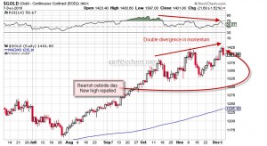
Gold - Daily Charts

As can be seen from the above charts, the climb up for gold has been loosing lustre, at least for the intermediate term. Each successive peak has been on declining momentum.

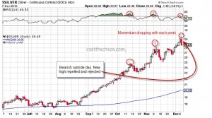
Silver - Daily Charts

As one should expect the picture is similar for silver, double negative divergence just as in Gold. Also both these precious metals made new intraday highs only to be repelled lower and rejected by the market - a bearish outside day formation.

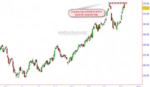
CRB Index - Double Top potential

The CRB index has also formed a bearish outside day right the previous swing high and thereby raising the possibility of a double top formation.

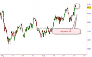
Crude Oil forms a shooting star

A shooting star pattern is visible on Nymex crude. The momentum here too has been diverging negatively with the price peaks.

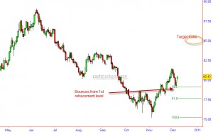
Dollar Index - Bounces from 38.2 Fib retracement

A look at the charts of the Dollar Index, shows that the Index has probably resumed its uptrend after a 3 day corrective decline. The index is bouncing from its first fibonacci retracement level. Over next 4-6 weeks a level of 85 is the price objective for this currency basket.

Barring an immediate reversal in the above markets( though not impossible), one should expect the negatives to start trickling into equity markets.

Nov 242010
 

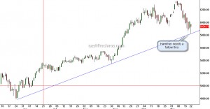
The boundaries of yesterday's low and high marked an important level in many global markets. On Sensex/Nifty yesterday's low is of significance. It was not just a 'hammer' pattern - the low also came of an important trendline.

Nifty - Daily Charts

The trendline is more perfect if drawn on the Sensex, we can connect the lows of March 2009  through these significant lows. A close below yesterday's low can make things turn nasty and that makes yesterday's low a must hold.

Correction or trend reversal?

 Uncategorized  Comments Off on Correction or trend reversal?
Nov 152010
 

In June, I had posted a note on this indicator and wanted us all to keep an eye on it. However, the indicator averted a double top risk and stayed above the previous trough during the May-June correction. Once again its time to keep an eye here. If this indicator dips below the orange line, it would be first warning sign that the existing uptrend is starting to turn weak. Although the possibility of a trend reversal exits only below the red line. I will post an update on this indicator if the indicator dips below either of these two levels.

Indian economy barometer

However, this time around there are couple of things that are loaded in favour of the bearish camp. One, Reliance is an under performer unlike the previous time. Two, SBI, a key leader in this rally, has also started to show pronounced weakness. Thirdly, there is a pronounced negative divergence on Nifty/Sensex daily charts.

What's favouring the bulls? The longer term momentum has matched with the price peaks and one possible wave count points to another leg up (need not result in a  high though).

Dollar Index – Either a bottom is around the corner or a bottom is in place

 US Markets  Comments Off on Dollar Index – Either a bottom is around the corner or a bottom is in place
Nov 092010
 

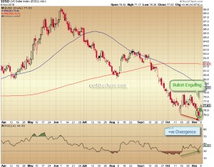
Dollar Index - Daily Charts

The daily charts of Dollar Index shown above, the drop from October lows to November lows is not matched by a momentum drop. This kind of positive divergence is usually a precursor to a trend change.

Powershares DB US Dollar Index Bullish Fund

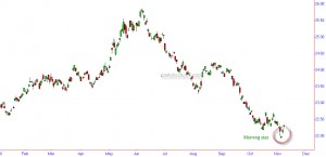
The UUP charts shown above, a morning star candlestick pattern is visible.  When this pattern occurs it is usually a strong reversal sign.

Also, I can count 5 wave decline to the November lows and Sentiment readings from Trade-Futures are pointing to a very extreme level of bearishness for the dollar index (hence bullish from a contrarian  perspective).

So what does all this mean for the other markets? Commodities and stocks closely tied to commodities are very likely to be the immediate victims. The daily correlation for equity markets with the Dollar Index, though varies now and then, currently stands at a range of -ve 0.83(for S&P)to -ve 0.94(for NSE Nifty) i.e. a very high inverse correlation. It is pertinent to note here that such a high inverse correlation existed for equity markets in November 2009 and when the Dollar Index started a powerful rally in December, a correction in equity markets commenced not until January. So a correction or a trend change in equity markets may either be immediate or may start with a slight lag depending on the strength of the anticipated USD rally. Stay cautious and watch how the markets pan out over the next few days.

Sep 082010
 

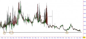
The readings on NSE India VIX are approaching extreme levels. Although they haven't yet reached the most extreme readings since its inception but it is at its lowest readings on a closing basis. The current level of complacency is much more than it was during the January 2010 highs.

India VIX - Daily Charts

As can be seen from the chart above such low readings have often corresponded to significant peaks of April highs, July/Aug 08 highs and May 08 highs. Had it not been for the limited history of India VIX, I will be sitting with a bucket load of puts.  But being a conservative trader, I prefer to act on things with much longer history. If aggression is your cup of tea here is a chance to pre-empt the market. Nevertheless, this is a chart that might be worth every trader's attention.

US Markets – Is the down trend under risk?

 Uncategorized  Comments Off on US Markets – Is the down trend under risk?
Sep 022010
 

As a trader it's very important that one remains open minded in the market to see the patterns and trends that are evolving. With the S&P surging to one of it's sharpest gains in the last 2 month's, I did try to take a view on markets like someone starting today on a clean slate.

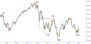
As can be seen from the chart below - there are 2 competing patterns that are trying to overrun each other's lines of defence, namely the bearish head and shoulder pattern(red) and the bullish (potential) inverse head and shoulder pattern (IHS - blue). What is also obvious is that there have been 3 breakouts (circled in orange) that have not seen a follow through.

S&P 500 Daily Charts

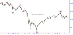
In order to anticipate how this stalemate is likely to resolve, lets try to look at the longer term market structure using Elliott wave analysis.

S&P weekly charts - EW Count

It can be seen that the S&P is still progressing in its fifth wave and is essentially in a down trend. So one should expect this rally to fail somewhere along the way.  Even if the S&P does manage to break out of the IHS neckline at 1131, the probability of it failing under 1220 looks remarkably high. The reason being that the price and time have squared at 1220 high in April and (unless my calculations are wrong ) 1220 is likely to be a multi-year high. Also, a retest of the high of at 1220 would once again be within the template of 1937-38 bear market structure (see April 28th post).

So, I see this as a short term trading opportunity on the long side though I still do not find any overwhelming reasons to be bullish over the medium- long term. Also, my cycle analysis is pointing to a cycle high on the 6th of September (with 1 day tolerance) and I will be watchful to see if the market is coming under pressure under the obvious resistance levels of 1094-1100 and 1131.

PS:  I have looked at the US markets in isolation using the S&P. The SOX is well below its July lows and Russell 2000 has retested its July lows - these under performances are usually good leading indicators.