Gold, the Buffett slayer

 Uncategorized  Comments Off on Gold, the Buffett slayer
Feb 172012
 

A recent business insider article calls 'Gold bugs' thin skinned misanthropes because Warren Buffett "..devotes a few paragraphs to gold and the fools who worship it" in his upcoming annual letter!!   Regular followers of this blog know that I had turned cautious on Gold around $1700's and bearish in September 2011 - just establishing I'm no gold bug.

In my May 2010 post, I had highlighted how such fancy theories can be quite flawed and prevent you from arriving at the best investment decisions. Now to Mr Buffett's renewed Vitiriol against gold:

1) The cube of gold will produce nothing in the next hundred years

My answer: No one makes investment decision for next hundred years

2) The cube of gold will not pay you interest or dividends, and it won't grow earnings.

My answer: So will be the case with a boat load of stocks. The S&P has gone no where in the last 13 years.

3) You can fondle the cube of gold, but it won't respond.

My answer: Yes, witty.   Hence I'll try to be funny too.   Mr Buffett should know what to fondle.   If you own lots of gold you do not need to fondle, 'they' will fondle you 😀

The reason for Mr Buffett's bashing?   Well, whatever I say would purely be a guess but I would let the performance of Gold speak for itself:

Gold's return for the last 10yrs - 488.19%

BRK's return for the last 10 yrs - 67.77%

Gold continues to wallop the performance of  Berkshire Hathway by a GIGANTIC 420% over his preferred time frame of 10 years.

And if you had listened to Mr Buffett's  Annual letter of last year, you are in the elite company of those who missed the best performing asset class of 2011 - long dated bonds that returned almost 30%.

Here are the words of another  billionaire who is in the same business. "At the end of the day, your job is to buy what goes up and to sell what goes down. So really who gives a damn about PE's?" – Paul Tudor Jones
Sep 162011
 

Silver saw a steep drop from $50 to $32 in the month of May and the rise post that has been in a corrective fashion.

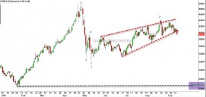
Silver - rising wedge

The above chart of silver shows a rising wedge pattern with a typical throw-over to the upside. Yesterday's close was well below the bottom of the rising wedge and this should usher in a sharp down move for the industrial metal probably before the end of this month. Looking at the chart from an Elliott wave perspective, silver is probably in its powerful 3rd wave or C wave which has the characteristics of wave 3. At $26.7 the first leg of the decline from 50 would be equal to the move from 44.27 (and hence A=C), the August peak, which seems like the minimum drop that is likely for silver. Also the $26 zone is the previous 4th for Silver.

Naturally, some of us would be thinking, "what happens to gold now?"

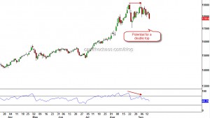
Gold Daily Chart - Potential for a double top

Here too, it is obvious that Gold is running into troubled waters. A fake print above 1913 high, momentum disagreeing with the new high in price are all tell-tale signs of exhaustion. A close below 1763 or an intraday drop below 1705 would complete a double top for gold and should draw prices at the very least to 1480.

Given the fact that the Dollar Index too had a breakout to the upside just a few days ago,  you might want to pay considerable attention to these signals in the precious metals space.

Aug 102011
 

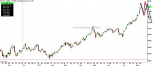
The up move in Gold is starting to look similar to what silver was in April. Yesterday's intraday high of 1782 and a much lower close is the first warning sign. This does not necessarily mean that Gold will start crumbling right away. In fact an erratic rise, like the two scenarios shown on the chart below would give traders an ideal shorting opportunity and would be a classic parabolic end.

Gold - Daily Charts

In Technical terms: This is an extended wave 5. Almost always when the extended moves ends, it will be followed by a VERY HARD drop.

The sentiment picture: Talk to anyone around you, they will tell you must be insane not to own gold. I've been seeing facebook status from wannabe analysts and public stating heads or tails Gold wins. That is your sentiment picture screaming that the boat is about to capsize.

So, it is absolutely essential to understand that this not the time to create new long positions in Gold. If you are already long, be ready to fold.

May 062011
 

Just one day  prior to the anniversary of Dow's 1000 point crash, the Ghosts of the 'flash crash' came back to haunt risk assets with greater ferocity. Crude got walloped by 10%, Gold got slammed by over $50 and Silver was decimated by another 12% on top of its recent sharp drop!!

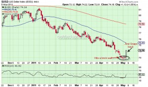
The force behind this move is the Dollar Index, which until now had refused to head higher despite being heavily oversold on multiple counts.

Dollar Index - Daily Chart

If you look the charts of UUP, the bullish dollar index fund, the 1.5% rise for this currency basket has come with a massive buildup in volumes. Also a gap up in UUP after a congestion holds the probability that the gains could stick and could even be a reversal.  A follow through in Friday' session for the USD would bode well for those rare Dollar Bulls. One thing that is quite clear, if this is not the reversal for the green-back, whenever it occurs, what we saw in yesterday's session is a mere curtain-raiser of things to come for risk assets.

Looking at the charts of Gold and Crude, there is more evidence that this is probably a turn of high significance for the intermediate to long term.

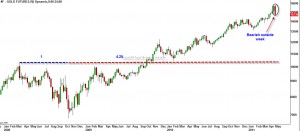
Gold: The weekly charts of Gold will end up being a bearish outside week (unless it recovers $40 in today's session) and this high probability reversal has occured at a very important time ratio as shown in the chart.

Gold - Bearish reversal

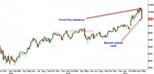
Crude: A bearish outside week in crude and  Price/Time have squared at the high.

Crude - weekly charts

Gold and Nifty

 Uncategorized  Comments Off on Gold and Nifty
Jan 242011
 

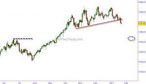
Gold broke through a short-term trendline and has opened up potential for downsides. (If you see our last few posts on Gold, we have been anticipating this decline.)

Gold Daily Charts

If you are a wave fan, you would note that this decline is coming after a 5 wave advance and this decline below 1352 marks the beginning of a strong decline. We are expecting the shiny metal to find initial support around the June highs of 1265.

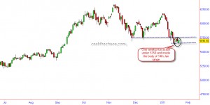
The Indian stock markets though had an advancing week, people have to pay attention to the range of last week.

Nifty Daily Charts

The whole of last week  markets meandered under the range of previous Friday's(the day it breached key support at 5690)  range!!! If this is not bearish consolidation, what is??

Topping signs in Precious metals, CRB Index, Crude

 Commodities  Comments Off on Topping signs in Precious metals, CRB Index, Crude
Dec 082010
 

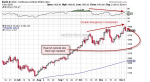
Gold - Daily Charts

As can be seen from the above charts, the climb up for gold has been loosing lustre, at least for the intermediate term. Each successive peak has been on declining momentum.

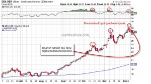
Silver - Daily Charts

As one should expect the picture is similar for silver, double negative divergence just as in Gold. Also both these precious metals made new intraday highs only to be repelled lower and rejected by the market - a bearish outside day formation.

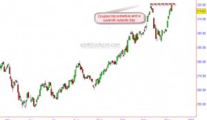
CRB Index - Double Top potential

The CRB index has also formed a bearish outside day right the previous swing high and thereby raising the possibility of a double top formation.

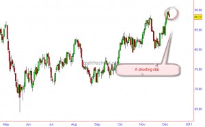
Crude Oil forms a shooting star

A shooting star pattern is visible on Nymex crude. The momentum here too has been diverging negatively with the price peaks.

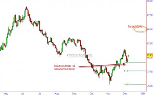
Dollar Index - Bounces from 38.2 Fib retracement

A look at the charts of the Dollar Index, shows that the Index has probably resumed its uptrend after a 3 day corrective decline. The index is bouncing from its first fibonacci retracement level. Over next 4-6 weeks a level of 85 is the price objective for this currency basket.

Barring an immediate reversal in the above markets( though not impossible), one should expect the negatives to start trickling into equity markets.

Red Alert: Five Charts and their implications

 Commodities, Indian Market/Stocks  Comments Off on Red Alert: Five Charts and their implications
Nov 292010
 

A couple of  weeks back I had posted a note on my own derived indicator and highlighted how important it was for the indicator to hold above the previous trough. On Friday, this indicator dipped below the previous trough on a closing basis and has warned that the Indian markets have probably peaked and a bearish phase is a very distinct possibility. So naturally one has to ask - how has this indicator fared in the past?

Indian economy barometer

This indicator has a commendable track record over the last 10-12 years:

1) In 1999 - the indicator peaked in Oct 1999, and warned of a bear market a few weeks before Sensex and Nifty peaked.

2) Likewise in 2003 when the Sensex/Nifty bottomed in April, this indicator was a few months ahead signalling an impending new bull market (some might consider Oct 01 as the bottom for the Indices, even then this indicator was ahead)

3) In 2006, during the infamous sharp drop in May this indicator stood its ground.

4) In Oct/Nov 2007, this indicator warned of an oncoming bear market.  The Indian markets peaked in Jan 2008.

It is often a good idea to look at other inter-related markets before coming to a conclusion about a major trend-shift. And here is where the fixed income /bonds come into the picture. Here is a chart of the 10 year OIS swaps.

10 Year Swaps - Daily Charts

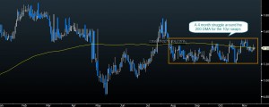
As is evident from the chart, there is still an intense struggle to cross the 200 DMA. AND when stock markets were trading near the all time high, the 10yr swaps were actually miles away from the peak made in February!  If stocks are that attractive why are investors still seeking the safety of fixed income?

I have for quite some time held that the continuation of this bull market is largely dependant on the debasement of the USD. Which was exactly why I had stressed the importance of staying  near the door of the bullish camp and having price objectives as opposed to a price target (see CNBC interview) on emerging markets, Gold, Silver and other asset classes. That brings us to the chart of the Dollar Index:

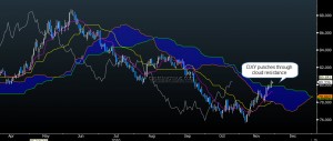
Dollar Index - Ichimoku charts

Not only has the Dollar Index reclaimed the key level of 80, it has also punched through the cloud resistance on its daily charts. If  my reading of the wave count here is correct, what we saw between QE2 day and Nov26th was just a milder part of the Dollar Index rally. The stronger portion of the rally has just about begun! ! (Remember the tight inverse correlation between emerging markets/commodities here and here?)

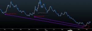
In 2010, emerging markets have had 2 significant corrections prior to November. One in Jan-Feb and the other one in Apr-May. The gross short interest in MSCI EM was 15% lower at November peak when compared with the January peak. That is a substantial level of complacency!!

MSCI EM Gross short interest

Let us also look at Gold which can give us a fair idea of inflationary/deflationary pressures in the global economy.

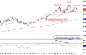
Gold Daily Charts - A potential H&S top?

The daily charts of Gold shows us that the swing to 1425 is in disagreement with the momentum readings. We can also see the potential for a Head and Shoulder top formation.  A close below the neckline, currently at 1340, is likely to augment further selling and a minimum drop to 1225 level is the expected outcome of such a breach.